Saturday, May 1, 2021

I'm Free Production Blog 6

I'm Free Sprint 6

Our second-to-last sprint is finished. The levels are all filled out now and we're finishing up our features as well as implementing most of our art assets from 2D art for the UI and character models as well as animations. I was assigned four cards this sprint with two cards carrying over from previous sprints. 

I finished creating the forest level as my first priority. It's important, after all, to finish implementing all our levels. Since this was the last level and the least expected level that the player would reach, we decided against making any new 3D assets/models so our 3D artist can focus on creating the player and enemy models. I used mostly the organic models to create what would feel like the last stretch of this environmental narrative where the player escapes from a lab, a zoo, a military hanger, and finally reaching a forest. This level might be repetitive with just mostly using previous assets and mostly organic assets but the intention was to make a sort of endless forest. 

Forest Level

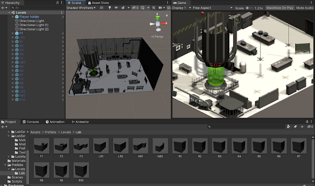
After finishing this card, I then worked on fixing the lighting. This was one of the criticism we received in our feedback and that was the uneven, clipping lighting of the levels. I researched if there were better ways to light each level differently. At first, I tried to bake lighting but I noticed it bakes on the whole scene rather than individual items. And even then, its difference isn't impactful. Thus I could only turn to the one thing left I could think of, scripting. With my average and basic programming knowledge, I made scripts that refer to a lighting manager script with a switch function that would instantiate prefabs of different lighting groups whenever the player reaches a different level's large room. Since our levels are randomly generated, I added a collision box to the three big rooms of each level. Each level's collision box has a different script that changes the level's number which runs through a switch function and bools that would detect whether a player is in a new level or not. If the player reached a new level, the previous level's lighting will be disabled and the next level's light will be spawned. I also knocked the forest lighting card out of the park since I figured out the lighting for the forest level while working on the lighting card.

Lighting swap for each level

Lighting Script

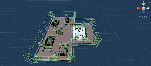
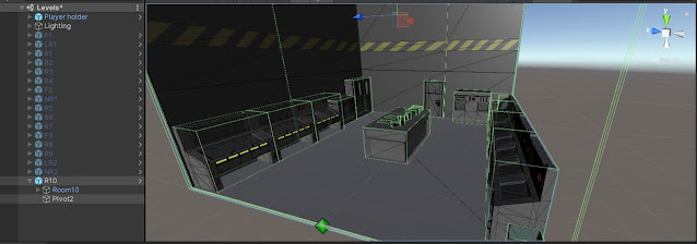
Lastly, I worked on making sure the player cannot clip through the level. Other than making sure the walls surround the level, I also had to remove assets that are near the walls as it allowed players to clip through walls despite how thick the box collider is. This meant the majority of the pipes in the lab level had to be removed. I also had 45-degree blocks for the corners so the corners are more reinforced.   


The only card left was to add the enemies into the game which would be the first thing to do in our last sprint and to get done before the Beta build is due. The next sprint will be the last one so the main focus is to fix any last-minute errors that would inevitably come when constantly playtesting our game as well as adding in any art assets that will be done or are done by Sprint 7. We've almost reached home base. Until then! 


Sunday, April 18, 2021

I'm Free Production Blog 5

I'm Free Sprint 5

We have reached the last legs of the production pipeline with the end of Sprint 5 now. Mostly we've finished our features with the enemies being the one last feature to focus on. For this sprint, I was assigned 5 cards with a total of 8 points. With the cards from the previous sprint, I completed 8 cards with a total of 12 points. Needless to say, this has been a rather productive sprint for me. 

The card I finished first was tweaking the walls of our small levels as in the feedback people mentioned how the walls obstructed the view of the player, especially the hallway rooms where each room is smaller. I went through the prefabs I had completed thus far and made sure the smaller rooms did not have the front and back walls. At the same time, I finished implementing the assets and the lighting into the Zoo level and sent them into "To Verify". 

The next cards I focused on were the cards for the Military level. The first card I focused on was "As a level designer, I need to implement the military base assets into my level to match the tone and theme" which is the asset implementation card for this level. Since I've done this two times already, the process went a bit faster. I also swap the roles of the shutters and the fence from the Zoo level to the military level. The fence which was the "walls" in the Zoo level are now "punchable assets" in the Military level. Then it was the same for the shutters which were "punchable" in the Zoo but now "walls" in the Military. This meant they had to be new prefabs because their roles were swapped. The "walls" wouldn't have a rigid body that allowed them to be punched and flying out from the level. 

An issue I encountered shortly after was that the zoo level still had unpacked prefabs. So I had to go back and replace any and all prefabs that are not properly implemented or using the correct prefab. This was to be a meticulous and attentive task so this issue would not arise again in the future. I really hope all prefabs are properly and correctly added so I would not have to go back and delete and re-add the assets. 

Military level made into prefabs and added to script

Next, I worked on the lighting which went as smoothly as the Zoo level's, which is to say, they were troubling. The Lab level's lighting was easily done as it was interior lighting. But for the Zoo level and military level, their lighting was to be imitating outdoor light, which is different and more difficult. We decided that lighting would vary between levels, so we would not be able to use a directional light without creating a script that would turn on and off groups of directional lights whenever the player reaches a new level. Our programmer is already busy with other features, so it was decided to look for a way to create individual lighting. This led to the lighting being uneven within each room itself because each level had a handful of spotlights and point lights to try and light up the room(s). The line between grounds/floors would be apparent and it was sometimes obvious to see a spotlight or point light. When this issue was brought up to the team, our programmer mentioned that we should try to bake light into levels. However, with an electronic prototype coming up, this was to be a card left for the next sprint. 

Lab Lighting (Interior lighting easier done)

Zoo Lighting (Trying to imitate bright daytime, exterior lighting)

Military Lighting (Trying to imitate evening, sunset exterior lighting)

As the level designer cards for the sprint are complete, I moved on to help with audio. I was assigned cards that asked for a siren/alarm sound effect, a menu shuffle SFX, and background ambiance for the Zoo level. Luckily I worked on audio back in Parasitic so I didn't have any troubles with audio. I looked on freesound.org for audio as all audio was allowed to be used and edited for free. It's a great site. I then moved the audio files into Audacity for clean up and looping. My process is first cleaning audio or any background sounds and trimming parts that I don't need. If they need to be looped, I would find a few seconds of the end at a zero position and fade it out. I would then move the end to the beginning and fade in the seconds of the beginning in alignment with the end clip that was moved. This makes a rather seamless loop. 

Example of seamless loop

I also combined audio together to get a certain ambiance. For example, the Zoo level's ambiance is windy with bird noises. I found a decent length of windy audio and looped it. Then I looked for an isolated bird sound audio that was lengthy and looped it as well. I combined the two audio together to get a windy background ambiance with occasional bird calls. 

Wind audio combined with isolated bird sounds

I looked for three different clips for the three different audio cards I did. The menu sound effect cards had 4 different audio clips because I wasn't sure which would fit the game. The only problem I had with this card would just be Trello's max file size. To combat this, I imported the assets to the Google Drive and linked them in the cards before sending them to "To Verify". 

This would be the end of the work I did for Sprint 5. The next sprint would be focused on fleshing out our last level, the Forest. After that, I would need to tweak the levels based on feedback and constantly playtest the levels. The last thing would be adding the enemies to the levels when they are fully developed and programmed. Until Sprint 6!

Sunday, April 4, 2021

I'm Free Production Blog 4

I'm Free Sprint 4

The end of Sprint 4 is here. We're just about halfway done with production. For this sprint, I was assigned 5 cards with 2 cards carried over. The cards I was assigned were to reorganize the blockouts to the level templates, the lighting cards for the rest of the levels, and adding assets and building the zoo level.

Our programmer made a levels script that held the prefabs for the rooms that would be randomly generated. These prefabs need to follow a template that had start points and endpoints in each room with the start points at the (0,0,0). To be able to test the random generated, I reorganize the blockouts into prefab variants of the room templates with the spawn points and moved the room and endpoints to the (0,0,0) point and the end of the room. Then I added them to the prefab folder and the levels script. 

Block outs all at (0,0,0), added to prefabs folder, and levels script (right side)

During spring break, I worked on the easier and less time-consuming cards. Those would be the particle effect cards that were carried over from the previous sprints. I first worked on the electric sparks card because I have done a similar particle effect for a previous class. All I needed to do is export it from the past project and import it over to the current game. I played around with the settings and made it fit the particle effect we needed for our game. I changed the shape from where the effects flew out from linear to a more circular motion and increase the speed of it so it looked more comical that would the theme of our game. They also have collision detection so the sparks will bounce on and off of surfaces and objects.

Electric Sparks

The blood effect took a bit more time and effort but luckily the motion is similar to the sparks. I did encounter a problem with the particle system in that the color over time did not work. The blood effect is supposed to go from red to a dark maroon over the course of its lifetime. However, the colors do not change. I changed the shaders and tried using different alphas/templates but it still doesn't work. My teammates also had a similar problem with their particle effects in that the shaders turned transparent if they did not use a certain shader. My problem was that using different shaders made the particle completely black or transparent but the color over time still did not work. It's not an impactful problem and the effect still looks good without the color change so it's not too much of a problem. It is still unfortunate that little detail isn't shown. 

Blood splatter

After the break and finishing the particle effects, I worked on building the zoo level. I added the zoo and military assets to the asset folder and started building the rooms with the level templates via prefab variants. It's a tedious task to make sure each room looked unique with the limited models we have. I also had trouble keeping in mind the blank spaces for enemy placement and not having the zoo level look cramped as it's the most open and brightest level. I also needed to go back and forth from the scene view and game view because I'm adding assets with a perspective camera view while the game is played in an orthographic camera view. We also decided to remove the door and sidewalls of the smaller rooms based off of the feedback we received from our electronic playtest. 

Zoo Level

After the building of the level and rooms are done, I added them to the prefab folder and the script. The next card and the one I'm currently working on is adding lighting. Since lighting is different for each level, we might need to have individual lighting for each room. But this is really difficult to do since spotlights and area lights do not light up the room as efficiently as directional light. The lights also need to be specifically placed and the radius of the light might affect adjoining rooms. I'm still trying to figure out how to do the lighting. This would be the biggest thing to focus on at the beginning of Sprint 5 since the cards carried over from Sprint 4 are the lighting cards. After I will be building the military level and working on sound. Until then, I'll do my best. 

Zoo 1

Zoo 2

Zoo 3

Zoo 4

Friday, March 12, 2021

I'm Free Production Blog 3

 I'm Free Sprint 3

Sprint 3 just finished and we're a third-way done with production and just built our first electronic prototype. For this sprint, I was assigned 7 cards with 1 card carried over from the previous sprint with a total of 10 points. I completed 5 of those cards, marking my total points completed as 8 points. 

The cards I was assigned were adding lighting to the level, doing annotated maps for my blockouts, and when I completed those cards I was also assigned a few particle-effect cards for me to work on as I waited for the assets for the upcoming levels to be done. 

Since our electronic prototype is coming up, I planned to finish the card that was carried over from the previous sprints about adding assets and actually fleshing out our levels, "As a player, I want to feel like I'm in the middle of a science lab with a bunch of equipment and breakable objects for me to smash and rampage through." Adding the assets was, needless to say, pretty busy work. The assets were wonderfully made and easily pieced together. It was just my job to make sure they come together to complete a picture, like solving a jigsaw puzzle. I tried to make each room different and followed most of the layouts I did in the blockouts. Of course, scaling and props did not match the basic geometric shapes I used in the blockouts so there are parts where I took creative-license. I also tried to avoid art fatigue as well where players will feel tired of looking at a level due to the repetition of props and layout. 

Lab Level Done

When I was partly done with adding assets, we encountered a problem. Which was generating the levels and making each room an individual piece, a prefab. I was following my block out so everything was laid out in a long hallway sort of fashion which wouldn't work with the code. Instead we needed a special template to add rooms in so they can be spawned in and snapped together with "spawn points". I went back and incorporated this in every room so they followed the same template with each room starting at (0,0,0) instead of a long hallway. 

Room Template: Two Spawn Points (Room Start and Room End)

I had been working on the lighting card at the same time when I was fleshing out the level with assets. After some feedback, I went back and decreased the brightness a bit and played around with gray colors in my three-point lights, then sent the card to "To Verify". 

Lighting

When that card was done and room prefabs were given to the programmer to work on room spawn, I decided on working on the annotation cards next. I did each annotation in order from Lab, Zoo, Military Base, and Forest. I referenced back and forth to the blockouts in Unity to the annotations I made in draw.io. Of course there were some problems with the scaling since it wasn't perfect or exact to the ones in Unity (not to mention the previous problem with Unity and the scaling issue in there). 

Annotated Maps

Regardless the annotations and the blockouts were pretty similar save for the actual enemy placements show in the annotations. During this I realized the levels might need to be more open to have room for enemies to "fit" in the level. This will be further thought about when the scales of the enemies and how they move is fleshed out by our modeler and programmer. 

With no cards left, I asked for more cards and was assigned to do two particle effects, electric sparks and blood splatters. My work on particle effects is very basic but I'm excited to tackle them. However, I did not really have time to work on them before the sprint ended. The cards I was assigned for Sprint 4 were cards for lighting in each level, adding assets for the Zoo level, and redoing blockouts in the style of the room template. I decided to hold off on the particle effects for now (Art < Mechanics) since our programmer requested that I should go back and tweak the blockouts so they all follow the room template (rooms at (0,0,0) and not a long hallway). This card felt to me like a higher priority since this is needed to test the room spawning mechanic, a core feature in the game. Thus that is the card I'm currently working on as Sprint 4 begins. I hope to be able to finish all my cards in Sprint 4. Until then. 


Sunday, February 28, 2021

I'm Free Production Blog 2

I'm Free Sprint 2


Another sprint completed and a decent amount of work got done! We've mostly finished building the foundations of our game. For this sprint, I was assigned 2 cards with a total of 6 points since they were 3 points each. Since I had 2 cards left over from the first sprint that makes the number of cards I have assigned is 4 total. And by the end of this sprint, I finished three cards. 

The cards I was assigned have to do with blocking out the rest of the other themed levels which are a military hanger and a forest. Once the player survives the lab and the zoo level they'll get to the hanger and lastly the forest level which is supposed to be highly unlikely. 

I first finished the card I was already "in-progress" on since the last sprint which is "As a player, I want to feel like I'm free from the lab I broke out of and now in the open air, however, I'm still fenced in and must keep moving to the right". I originally went for a long forested look with bigger and lengthy-er spaces to emphasize the "free" feeling of breaking out of the cramped lab. I did have trouble making it look like a zoo with just using basic shapes and not knowing what props were going to be made, but once the props and assets for the zoo level are done I can work around that. Regardless, cages and nature-themed assets are going to be central pieces so as long as I have that in mind, the block-out should turn out too different from the actual fleshed-out level. 

 
Zoo/Outdoor Level

Next, I blocked out the military level where "As a player, I want to make it past the zoo and reach the army hangar base that has office buildings, gun lockers, helicopter landing areas, and huge pallets and crates. " This one was pretty fun to block-out, I envisioned that some areas would be partially indoors since the card mentioned office buildings and gun lockers. It should feel more cramped than the zoo and forest levels but not as tightly packed as the lab level. 

Military Level

The last block-out left to do is the forest level, "As a player, I want to make it past the military hangar base and into the forest where I can see trees, vegetation, random animals, swamps, vines and boulders as far as the eye can see". This would be the last theme if the player ever survives past the previous three and will be continuous. After all, our game is an infinite runner. Thus I tried to make this level stretched, there's a lot of long pathways and curving/nonlinear trails. 
 
Forest Level

The card I didn't finish this sprint is "As a player, I want to feel like I'm in the middle of a science lab with a bunch of equipment and breakable objects for me to smash and rampage through." I did want to finish all the required block-outs before tackling this card but also we ran into some trouble with the models so I was blocked from doing this card. But Brandon, our excellent modeling who creates all our amazing assets got them done before the sprint ended so I can finish adding assets for the lab level early in Sprint 3 and before the first electronic build. So far, I've got the first room done and it already took a lot of assets especially with the individual railing and pipe pieces you need to piece together like Legos. I hope the player enjoys break it down and seeing all the pieces fly! 

Lab Starting Room

The only issues I ran into were the messed-up scaling with the block-outs and finding inspiration for the level block-out. The scaling would jump from 10s and 20s to 0.5s and 1s. This might be because of our grouping in the hierarchy and me accidentally scaling both the "empty" objects that are parent to objects in the scene. I would have to delete most of the scene to fix it so I decided not to. I would be using another scene to build the actual levels anyway so this wouldn't affect the game. Finding inspiration for the block-out is just trying to avoid repetition between levels. Of course, in hindsight, I think I was too worried about this because the block-out was just using cubes and cylinders and not actual props so I was thinking too much into it. Regardless this isn't a problem either since each level actually have different themes and layouts. 

Overall, I completed 3 cards and 7 points by the end of Sprint 2. There are no large issues that would complicate us as of now. For Sprint 3, I was assigned 5 more cards which have to do with going back and actually annotating my block-outs so I can use the "level design" as portfolio pieces and an outlier card for lighting. Hopefully, I'll finish all of them by the end of Sprint 3 so I'll have Sprint 4 to focus on adding assets to the other levels. Until then. 

Block Outs Done!


Tuesday, January 26, 2021

I'm Free Production Blog 1

I'm Free Sprint 1


My game project for CAGD 470 is an endless roguelike runner called I'm Free. My role in our team is the level designer. Now that Sprint 1 of I'm Free is finished, it's time to write about the progress of the game's development. For this sprint, I was assigned 4 cards with a total of 6 points. I finished two by the end of the sprint. 

The first card I worked on and completed was "As a level designer, I need to block out a cookie cutter template map that will be used to send the player in multiple scenarios." As the models and mechanics are being worked on, I'll start designing the generated levels by blocking them out in Unity. Our initial decision was to make square levels that could interchangeably connect together if they're all the same dimension, hence "cookie-cutter" levels. But after blocking out some levels and going over how the game plays, I realized that our gameplay was very linear. I talked to our producer about this and we decided to use Ape Out as inspiration in terms of level progression. Instead of just square rooms/levels, there will also be non-linear levels and larger rooms that connect together. Basically, instead of one long hallway, the game will play in a pattern of room-hall-room.

This is where the "As a level designer, I need to block out differently shaped maps that stem from a square base and can connect to one another and send my character through different paths and scenarios." card comes into play. In a sense, I worked on these two cards at the same time, piecing together blocked out room and halls together. 

Square levels / "cookie-cutters"

Non-linear levels

After blocking out about twenty different rooms for the laboratory, we decided that we should add more settings so the game will have an underlying narrative. After the player completes a number of laboratory levels, they will head outside. Thus my next assigned card is "As a player, I want to feel like I'm free from the lab I broke out of and now in the open air, however, I'm still fenced in and must keep moving to the right". The task for this card is to block out a number of outdoor levels. This is also the card that was in-progress up to the start of Sprint 2. By the time, I'm writing this I just finished blocking out the levels for our outdoor levels. I also realized that the scaling of these levels is messed up. Some rooms go by 1s and 10s while other rooms had decimals. I'm not sure where in the process I mixed up the scale but it shouldn't be too big of a problem as these are only block-outs and are not placed in any actual Unity scene that would be used for the game itself. It just is confusing to scale things. Even the player prefab we have was tiny in the level that I had to scale the entire two block-outs (the lab and the outdoor levels) to 0.2 units (depicted below). I also had to rotate the levels 180 so the camera was facing the correct way (depicted below). These are small issues thankfully and we should be able to progress forward without complications due to these problems. 

Outdoor level block out

Close up of the beginning of the outdoor level

The last card I didn't get to was "As a player, I want to feel like I'm in the middle of a science lab with a bunch of equipment and breakable objects for me to smash and rampage through.". This card was for adding the props and assets to the laboratory levels. However, I'm blocked as the models and assets for the laboratory setting are not complete. Our modeler, Brandon, is working hard to get them done and around the end of Sprint 1, he appears to have finished about 16 of the 17 models for the laboratory. I will probably work on this card once all the assets and props are verified by our producer and added to Unity. 

Overall, I completed 2 cards and 4 points by the end of Sprint 1. There are no large issues that would complicate us as of now. For Sprint 2, I was assigned 2 more cards about blocking out other settings such as a military base and a forest level. So currently I have 4 cards assigned and 8 points with one of those cards and points in "to verify". I'll most likely talk about the rest of my block-outs and fleshing out the laboratory level with assets in the next blog. Until then. 

Tuesday, December 15, 2020

Parasitic Release

Parasitic Release


After 4-5 months of production, our game has reached its final form. The amazing work of our programmers, modelers, level designers, and leads all led to this moment. I'm still in awe of being able to work with such a great and talented team of people. 

Our programmers have made it all possible with their awesome coding skills. Chase had done some incredible work implementing a lot of the art assets from audio to animation to particle effects. Jeremy's work on the UI and fog system really creates the game's atmosphere, his vocals also star in our game as the enemies' damage sounds. Ryan's slope system still amazes me, it looks fantastic and is very easy to pick up and use. It's really cool to be able to use it with some of the terrains of my first level. 

While we worked individually most of the time, I'm really grateful for the support of my fellow level designers who are both efficient and responsive. Joe is definitely the mood maker of us three, he's very supportive and tries his best to help everyone out. Xander definitely is the most experienced out of us because he is most experienced in both level design and turn-based strategy games, his feedback was very useful during the annotation phase of our levels. A big thanks again to them for helping me out and being there!  

Of course, the art and feel of the game would not be possible without our modelers, Brandon and Devin. Brandon was our environmental modeler, creating the high-quality low polys of what's visible in the game's environment. Level designers are able to give a list of assets we want in our levels and he creates them in a way where they all feel the same, which helps with the game's immersion and looks. Devin's work of our character and enemy models really sells the game. The players are able to differentiate the characters from not only each other but from enemies as well. 

Each and every one of us had worked in such a smooth and friendly environment thanks to our producer and game designer, Dylan and Alex. They are constantly and consistently giving feedback, keeping up an active Trello board, and helping everyone out. It's thanks to them our game had a smooth production due to the concept and idea being fleshed out thanks to Alex and having an active work environment thanks to Dylan. I could not have asked for better people to lead us. 
 
I'm really thankful to have been a part of this amazing team of people. This is my first time working on such a grand project of this scale where it really feels like you are developing a game in a work environment. And we did make an incredible game! Thanks to the hard work of our team Parasitic is published and ready to play! 

Get it here: Parasitic

Saturday, November 28, 2020

377 Mobile Development - Blog Post 3

Team Titan Sprint 6 - 7

This progress blog post about Titanic Arena's final two sprints, Sprint 6 and 7. Both of these sprints were focused on making and implementing art assets. Other than that, we kept making improvements to our game based on player feedback in our playtests. We are home stretch in our development and the goal for Sprint 7, our current sprint, is to polish and finalize our game. 

A Closer Look at Each Sprint: 

Sprint 6

Cards Assigned to Me: 12
  1. As a team, we want the APK to be ready by the playtest (1)
  2. As a player, I would like to be able to unlock dash (1)
  3. As a player, I want to be able to unlock the spearman character in the upgrade shop (1)
  4. As a player, I would like to know how to defeat each boss (1)
  5. As a player, I want to be able to unlock the rogue character in the upgrade shop (1)
  6. As a player, I want to be able to unlock the flailer character in the upgrade shop (1)
  7. As a player, I would like to see what each character is visually in the shop (.5)
  8. As a player, I want to know what the second shop does and is for via a panel or through controls (.5)
  9. As a developer, I would like to see the blood of enemies fly out when they are hit via particle effect or UI element (1)
  10. As a developer, I would like to see the blood of player characters fly out when they are hit via particle effect or UI element (1)
  11. As a player, I would like to visually see my health go up (1)
  12. As a player, I would like a dynamic game over screen so I am enticed to play again. (1)
Incompleted Cards: 1
  1. As a player, I would like a dynamic game over screen so I am enticed to play again. (1)
Half of the cards I was assigned to this sprint were art assets while the other half were cards about our final feature. This feature was decided by us as a team as a substitute for the cards about saving the game (after quitting the application) and creating individual player stats for each class because I couldn't figure out how to implement a proper save feature in the game and we weren't sure how to tackle the individual player stats feature. Instead, a character shop and unlocking feature would incite player replayability and add more incentive to use the shop other than to just buff the two upgrades available in the shop. The art assets I finished for this sprint were particle effects that give feedback for the player to know when they have taken damage or dealt damage to the enemies. I also added UI elements for the boss fights since each boss is unique and has different strategies or methods to defeat them. I also added a UI to the second shop or the character shop so the players know what the shop purchases do exactly. 

Second shop for unlocking classes or characters

Boss infobox 


Sprint 7

Cards Assigned to Me: 12
  1. As a Player, I would like to be able to choose to play an endless mode. (3)
  2. As a team, we want our game to be ready to be published in the Google Play Store (1)
  3. As a player, I would like a dynamic game over screen so I am enticed to play again. (1) [From Sprint 6]
  4. As a player, I want the control page to be clear and concise. There might need to be multiple pages for this to work. (1) [Feedback]
  5. As a Player, I would like a dynamic background for each of the levels (1)
  6. As a player, I want a feature graphic for the game that makes me want to download the said game (1)
  7. As a player, I want a dynamic poster for the game that makes me want to download the game (1)
  8. As a player, I would like to know when I can select a character (1)
  9. As a player, I want an enticing icon for the game that makes me want to download said game (1)
  10. As a player, I want the control page to work flawlessly and is visually helpful. (.5)
  11. As a player, I would like a moment of pause before the boss spawns so I can read the textbox (1)
  12. As a player, I want the rotation of the game to be locked (.5)
Completed Cards: 
  1. As a Player, I would like to be able to choose to play an endless mode. (3)
  2. As a player, I would like a dynamic game over screen so I am enticed to play again. (1) [From Sprint 6]
Our current and final sprint's focus is purely art assets and getting elements for our Google Play page ready. This included getting screenshots of the game, making graphics and posters, and even a gameplay video or trailer. More internally, I need to make sure our control page is as concise and coherent as possible since it's been our game's major flaw for the past few sprints as many players could not get through the character select screen. I need to also work on the feedback for our game's UI elements that were suggested by playtesters. So far I finished our game's dynamic game over screen, making it more appealing and graphic and as a team, we completed one of our epics which was to make the game "endless", this meant our game does not have a game over, similar to Temple Run, a famous mobile endless runner. 

Game-Over screen


Total Card Count (as of now):

Cards Assigned to Me: 56
Completed Cards: 46
Cards Left: 10

Total Point Count (as of now):

Points Assigned to Me: 60.5
Completed Points: 51.5
Points in Progress: 9

Since we are very close to the end of development, I can really see the total number of cards I've done and the hours I've worked. I try to be accurate when assigning points, there are very few 3 point cards and no 7-point cards at all. This is due to most larger cards being split up into more cards and often I used .5 for UI elements that changeable through the inspector or settings and do not require adding assets such as scripts or game objects. Seeing an overall total of the work I've done is very cool, it seems about accurate to have done roughly 2 months' worth of development work for our game over this semester. I'm thankful for my team to be great at their roles and being able to smoothly develop our game with only a few bumps here and there. I think our game is amazing and has many great features to offer. Thank you Adam for being a superb programmer and cheers to Austin for implementing the levels and helping with everything else. Great work team! 

Issues/Problems Encountered 

Problem #1: Save Feature and Individual Player Stats 
One of the problems I encountered during multiple sprints was making a save feature for our game. So far we have an in-game save feature that carries the upgrades and shop purchases over the screens but when the player quits the game, the game does not save. Saving a game is pretty difficult and I've spent multiple sprints tackling it. I've tried multiple tutorials online for saving games but none of them have bear fruit. I assume this is due to the save and serializing not being able to save the scripts with player data since those scripts are using Player Prefs.

Attempts at serializing and saving the game

Solution #1: New Feature Substitution 
 Regardless, since this feature is taking too long and we've reached our last two sprints we decided that we'll substitute the save game on quit feature with a new feature. This feature will incite the game's replayability and encourage the player to use the shop more. Originally, the player can choose a number of classes and characters to play as but with this new feature, they only start with the warrior class and need to unlock/purchase the remaining character classes on the second page of the shop. 

Scripting for locking and unlocking characters/classes


Wednesday, November 18, 2020

Parasitic Sprint 6 Blog Post

Parasitic Level Design Post#6

I prioritized finalizing the level I was working on Sprint 6. So most of the cards assigned to me this sprint are the final pieces I need to add to my level as well as the rollover playtesting cards. Since I was almost done with all my cards near the end of the sprint I was also assigned to look for audio. The cards assigned to me are: 
  • "As a level designer, I need to hook up the unique win condition in each of my levels. (1)"
  • "As a level designer, I need to play through my level to test for discrepancies or errors. (1)" [Sprint 4]
  • "As a level designer, I need to populate the Dead Forest level with current assets to get the tone of the level established. (1)"
  • "As a level designer, I need to set up the lighting in the level to match the theme. (1)"
  • "As a level designer, I need to playtest my level to check for discrepancies so the level flows smoothly. (1)" [Sprint 5]
  • "As a player, I want to hear a swoosh and glass shatter as I throw a health potion to one of my teammates as an archer. (1) (Ability 2) (3 Different Clips)"
  • "As a player, I want to hear flames as my bow lights up to show my upgraded attack. (1) (Ability 1) (3 Different Clips)"
  • "As a player, I want to hear the swift pullback and let go of a bow and arrow when I attack as the archer. (1) (Attack) (3 Different Clips)"
The two cards I worked on coincidently during the beginning of this Sprint were populating my level and added mood-fitting lighting to the level. Populating my level took a while since I wanted to make sure the trees were not too big compared to the player models which would break immersion and I also had to make sure the branches weren't too close to each other so the players can actually see what was going on on the ground level. I also used the small leaf assets to make piles of levels that cover the floor of the level. There were three types of leaf piles. The yellow Ginko leaves would do a better job at drawing the player's attention and I used them to hint at secret locations or branching pathways that might or might not reward the player. 

Ginko Leaf Piles (Treasure/Secret Area Indicators)

The next piles are maple leaves that were used to cover empty space between trees, they indicate areas that players could not move towards/enter. 

Maple Leaf Piles (No Entry/Off-Limit Indicators)

The last and biggest piles are normal, plain leaves. These are not very visible but they path the way for the player. The reason I used this was to hint where the paths are in the level but since they are not obviously visible, the player would need to look closer and pay attention to find this "cheat". 

Normal Leaf Pile (Outline of paths)

These details took pretty long since I also had to move other assets around them. The whole scene probably has a total tri count of 10+M considering one camera frame is 1-2M tris. I was a bit scared of this since I wasn't sure if having this many assets would lag the level or not. Luckily Alex said that as long as the frames didn't drop below 60 or when playtesting things don't lag, it would be okay. While the assets took a while, I'm really happy with how the level turned out. There's a lot of details in the level that probably isn't even noticeable or many players would just brush off but I'd be very happy if someone were to notice the leaves placed gently on the rocks and the crates in the level. 

Tris of the starting area in the level

I also tweaked the lighting for this level. My first "draft" was a grey-blue that seemed like a bright evening or a foggy sunrise for the level. 


But it was a bit too bright for a "dead forest" level most likely set in the evening or late at night. So I went back and changed the key light intensity from 1 to .3 as advised. The dark lighting does really give a scary and unsettling vibe to the level since the player would feel cramped and lost. 


After finishing these cards, I did playtesting for the level to make sure the assets do not block the player or hinder the flow of the level. Since this was before adding the level's objectives/win-conditions, the level was pretty difficult. Since this is Level 4, more enemies were of a more advanced and higher tier, meaning they do more damage and had more HP. Players also took a bit longer to level up and get points to unlock abilities. It would take a couple of plays to defeat all the 45 total enemies in the level and win. The player characters had a better chance of survival if they stayed together since the level was more maze-like. Unlike my first level with plenty of open space, if the players split up in this level, it would be difficult to regroup. 

After making sure the player can actually win the level and that the flow and difficulty felt smooth, I added the win-condition to the level. For my level, I made the win-condition for the player was to defeat the boss at the end of the maze, the brood enemy. This was really easy thanks to our amazing programmers, Chase explained it to the level designers in a quick and easy-to-understand way as well. I'm really grateful that we have an amazing team. 

Win-condition/Objective feature added

At this time, my only card left was to playtest so I asked the leads to give me more cards to work on. Dylan asked me to do some of the audio, specifically the sound effects for the Archer abilities. I finished up a few more playtests which made me feel that my level was at a great level of flow and difficulty after some tweaks. I'm currently looking for audio clips that best fit the Archer's abilities. 

So the cards that will roll over from this sprint are: 
  • "As a player, I want to hear a swoosh and glass shatter as I throw a health potion to one of my teammates as an archer. (1) (Ability 2) (3 Different Clips)"
  • "As a player, I want to hear flames as my bow lights up to show my upgraded attack. (1) (Ability 1) (3 Different Clips)"
  • "As a player, I want to hear the swift pullback and let go of a bow and arrow when I attack as the archer. (1) (Attack) (3 Different Clips)"
We have almost reached the finish line! The next sprint is our seventh and last sprint. I'm amazed at how awesome our game has become and at all the people who worked very hard on it. I can't wait to see how it will be finalized. So until then!

Wednesday, November 4, 2020

Parasitic Sprint 5 Blog Post

Parasitic Level Design Post#5

My tasks in Sprint 5 focused on fleshing out my second level: "Level 4 - Dead Forest". The cards assigned to me this sprint are mostly rollovers from the last sprint with only a playtest card being newly assigned: 
  • "As a level designer, I need to block out a large Dead Forest level that starts with our heros having to maneuver a maze before finding the exit that leads to an arena for a mini boss battle. (3)"
  • "As a level designer, I need to play through my level to test for discrepancies or errors. (1)" [Sprint 4]
  • "As a level designer, I need to populate the Dead Forest level with current assets to get the tone of the level established. (1)"
  • "As a level designer, I need to create clear boundaries for the player to restrict going off path. (1)"
  • "As a level designer, I need to populate the Dead Forest level with current assets to get the tone of the level established"
  • "As a level designer, I need to playtest my level to check for discrepancies so the level flows smoothly. (1)" [Sprint 5]

For this sprint, I finished the block out for my level. This took a while since I also had to edit each tile to correspond to my annotated map. 

Block Out

Tile Map

Currently, I am populating the level with the newly added assets I requested in the asset list from the last sprint. Some problems I've encountered from this is figuring how to place the trees properly for a "forest" level but spaced far apart so that the player can move and see the other assets (such as enemies, buff tiles, and pickups) in the level. I also went back and removed the colorized trees and mainly used the leaf-less trees so the level corresponds to the theme of a "dead forest" 

After I implemented most of the assets, I realized I needed the terrain as well. So I played with the terrain editor in Unity, moved it to blender, edited it so it's low poly and colorized, and added it back into Unity. Now I can add assets around the terrain as well so the level and the terrain feel more intersected/fused and not just two separate pieces, which helps with immersion. Here are progress pictures of what I have so far:

Reached 271 trees and still need more for the terrain

Terrain

The cards I have left are: 
  • "As a level designer, I need to populate the Dead Forest level with current assets to get the tone of the level established"
  • "As a level designer, I need to create clear boundaries for the player to restrict going off path."
  • "As a level designer, I need to playtest my level to check for discrepancies so the level flows smoothly." [x2]
I'm concurrently working on "As a level designer, I need to populate the Dead Forest level with current assets to get the tone of the level established" and "As a level designer, I need to create clear boundaries for the player to restrict going off path." For the next sprint, I'll be finishing up my forest level and moving on to playtesting it before it gets implemented into the build. Ciao for now.