Wednesday, October 9, 2019

Modeling Dinner Prep

CAGD230: Dinner Prep

Assignment Detail: In this assignment, we got an introduction to the tool Curve(s). With this, we could model the jar of our dinner prep scene. Luckily the scene is half laid out already as the wine bottle is already modeled for us and the lights and backdrop are already part of the scene. So what was left was to model the pasta box and the pasta sauce jar. Then we just needed to finish the items off by UV-ing and texturing. The pasta box was fairly easy to model. We did it with a plane and a template-box image on top. We could then fold the plane into a box and just detail it by beveling the box and fixing the image to look realistic. The pasta jar was a bit more difficult. We used the curve tool to model the jar. To model the jar and have the pasta texture inside, we needed to model the curve with two layers. An outer layer and an inside layer made up the jar. This allowed us to select faces inside the jar and duplicate them into a separate piece of the jar. We can then add the pasta texture on this piece so it will act as the pasta sauce inside the jar. The outer layer can act as a boundary and create depth for the jar. We used the glass preset on the entire body of the jar so it can be "transparent" enough to see the pasta textured object inside. We also had to UV the body and then select the label faces and create a label texture. The lid was easily modeled with the curve tool and then it was textured by a simple copper preset in the HyperShader. We UVed the wine glass the same way except the glass preset was set to a greenish color and was not "transparent" but opaque. After that, we just needed to add the labels on the body and the cork. 


Modeling a Table and Couch

CAGD230: TableCouch


Assignment Details: For this assignment, we need to model a coffee table and a couch from a reference. This assignment allowed us to get used to duplicating objects and grouping them. We worked more with UVs and using the sew and stitch tool. This is also the first assignment we use actual texturing with. The texturing was done with photoshop and texture images online. A decent knowledge of photoshop tools was needed for a good texture job. We needed to make sure the image is able to be duplicated seamlessly. To do that we used the stamp tool and offset filter to make sure the image is able to mirror itself and flow into each other without it looking strange or wonky. Both the table and couch were fairly easy to model, the tricky part was texturing. While it didn't matter how the UV looked in terms of face alignment (as the texture is just repeating), it was difficult to properly UV the couch. The couch is more beveled than cubic or "sharp on the edges". This made the UV hard to unfold and straighten out. Luckily it didn't matter too much due to the texture being a pattern rather than an image or text. I'm glad to say that I feel confident in the modeling aspect of this assignment. However, the texturing and UV-ing part was more troublesome. I didn't have the time to properly texture the couch and table, thus the table's wood actually looks too big to be natural and the couch is too shiny due to the lack of work on the specular attribute in the material. The scene is also a bit dark due to the lack of light sources. However, I can learn from these flaws and do better in my next modeling assignments.

Wednesday, September 18, 2019

Modeling a Marker

CAGD230: Marker

Assignment Details: For this assignment, we needed to use more tools aside from the basic transforms. This is the first assignment where we could work with vertexes, faces, and edges. There was a introduction to image planes, the edge-loop tool, extrude tool, combine tool, and union tools. We worked with UV and more texturing. Using all these new skills, we needed to model a dry erase marker. 


I actually had quite a few struggles with this one. For one, I had to remodel the marker twice before I could actually UV the marker. I messed up the first time by scaling the Z axis while in front view. It oval-ized the shape and made it difficult to properly model the cap and tip. The second mess up was when I was working with UV. The marker cap's cylinder map was not laid rectangular like the tutorial showed. It was more elongated with bumps sticking out. Even when I used 'Straighten UV' it only made it worse and fold some vertices downwards. In frustration of not knowing what the cause was, I remodeled the whole thing hoping I just made a simple mistake somewhere before I UV-ed my second attempt. However the same problem still sprang up. The cut of the cylinder map didn't start and end like the tutorial. Instead of starting the map's cut on the flat part of the cap, it started the cut in the extruded part, which causes parts to stick out. There weren't any clear answers online about my problem so I just decided to move vertices around and use "Straighten UV" to proper create a proper rectangle. Luckily the map didn't stretch out too much and the checkered template looked pretty decent in the model view. It was also lucky that the cap is just textured with a basic color, thus the my UV problem didn't cause much trouble. I can only hope such an issue doesn't arise in the future. And if it does, I hope I would know how to solve it.   

Tuesday, September 17, 2019

Modeling with Primitives

CAGD230: Primitives

Assignment Details: To get used to modeling, our first assignment is to build a simple scene using the basic shapes in Maya. We could not mess with the shape's vertexes, faces, or edges. We also couldn't edit their mesh. The tools available were mainly moving, rotating, and scaling. But it is still possible to build details and complexity off basic shapes, it just takes... more shapes.


The scene I built is a city, or rather, one street of a city. The shape I used the most would definitely be a cube. It's scaled to be a rectangle or a box but there are possibly around 300-400 cubes in the scene. The buildings would be the most obvious cube-primitive structures. There's also the awnings on the bottom half of most buildings. The point of the awnings were to show more detail than just a basic door. Rather than a simple building, some of the buildings look like storefronts especially similar to buildings in Chinatown. Windows took up most of the cube-primitives. Rather than using a plane, using cubes as windows felt more natural. Planes made rather flat windows, metaphorically and literally. I actually had trouble with texturing and adding materials. It was difficult making mainly the windows shine but it turns out the buildings and the sidewalk will have to too. This was before learning how to properly UV and texturing but I am pretty disappointed that the buildings and sidewalk reflect. The most detailed object is probably the smallest. It's the water towers and there's only two. One might be more noticeable than the other. They look possibly the longest to make because I was experimenting with snaps. Although it's not noticeable, they do look rather good for being made out of basic primitives. It's the littlest things that count.  


Monday, April 29, 2019

3D Level 1 Ver. 2 Feedback

3D Level 1 Ver. 2 Feedback
What went right?
I felt this playtest went better than the last. Mainly because I fixed some of the more pressing issues of the last playtest. Pressing issues being the spitters that didn't spit acid, which I've swapped with regular chompers. I also added a better mechanism for opening the doors. Instead of just the pressure plate (and the secret switch), I added another door that leads to the pressure plate. It can only be opened if the player defeats the three chompers in the surrounding area. It took a while to figure out how to properly program it and I'm glad I got it to finally work. Lastly, instead of trying to add a "portal" that teleports the player to another level, I just added dialogue (infobox)  at the end of the level to let the players know that they reached the goal or the end. 


new door mechanism
opens after defeating all surrounding enemies

What went wrong?
There weren't any strong apparent problems with my level. The feedback I received was that it was fitting for an introductory level and that the goals and objectives were clear. Many thought the "defeat enemies to open door" mechanic was cool and that it strongly enforced the combat mechanic on the player instead of letting the player get away without really using the combat mechanics. However, one playtester noted that having the secret switch would debuff that. Thus the secret switch is not really necessary in the introduction level even if it was pretty cool (I like secrets and easter eggs what can I say). 

Were the challenges presented appropriately to the skill level of the player?
Since there weren't blatant changes from the previous level/playtest, the challenges were the same. And yes, they were appropriately set for a tutorial level. In fact, I'd say the challenges are more enforced on the player with the new door mechanism I add. This was necessary to teach the player combat mechanics. The enemies are not difficult of course, 1 hit kills for all of them. And since the spitters did not work properly, I swapped them out for regular chompers. Which is a shame, but it is still fitting for an introductory level in my opinion. 

Was the critical path obvious?
The map hasn't changed from the first version. I did add more obstacles, but the path is still very linear. Thus the critical path should be straightforward and easy to follow, which I felt was important or better for a tutorial level. 

more obstacles

How would you improve?
I wouldn't know what else to improve on aside from trying to fix the problems I had in version 1 instead of switch most of the problems out for the second version. I would like to add more mechanics but I'm not a strong programmer and it would not be appropriate to throw too much at the player for the first level. 

How was the overall flow?
Overall, I'm glad many playtesters enjoyed my level. It was a bit short but it taught the mechanics that the players need to know well. The path to follow was linear and obvious so playtesters did not get lost and felt confused about what they had to do or where they had to go. 

Monday, April 22, 2019

3D Level Feedback

3D Level 1 Feedback
What went right?
The level of difficulty for the map was appropriate for an intro level. The players/playtesters thought that the length was good and that its critical path was obvious (expected of a tutorial map). The map worked as it was supposed to save for some aspects that were supposed to end the level and some transitions that didn't seem to work. That could be touched on more in another section. 

What went wrong?
The things that went wrong with the level did not interfere with the level itself. Or rather the main aspects of the game. One of the things that didn't work was the enemies introduced at the end that spit acid, however, the acid didn't appear/spawn at times (most of the time). I didn't find a solid fix for it when trying to look through forums online. Another aspect that didn't work was the transition that happens when you finished the level. Upon crossing the door, the player was supposed to teleport to the "level finished" scene. However, it didn't work and I also haven't found a solid fix for it either. 


Were the challenges presented appropriately to the skill level of the player?
For a tutorial level, the challenges were fairly easy. The level itself was supposed to teach the player more of the mechanical skills such as jumping, platforming, and basic combat. The level started off with easy platforming, jumping onto moving platforms and onto other parts of the level. There were boxes that introduced the player to combat before sending out the real enemies. The enemies for this level were fairly easy. Their detection radius was shortened as well as their "hp".  


Was the critical path obvious?
The critical path was pretty obvious, the map itself is linear as the player crossed and platformed through "open-air". The players know where they were going since there aren't any walls or solid corners. 

How would you improve?
The improvements I could make are switching aspects that don't work to other options. Such as the enemies, I could just switch the spitters to the chompers since the chompers would be more likely to do damage to the player. As for the transition aspect, which did not affect any gameplay or the flow as it supposes to appear at the end. I could have problem-solved harder. 

How was the overall flow?
Overall the flow was solid. For an intro level, it hit the requirements and did present an appropriate challenge to the player.


Monday, April 8, 2019

MegaMan Level 2 Feedback

Megaman Level 2 Feedback
What went right?
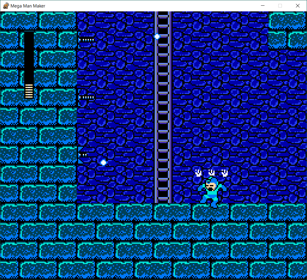
This map did get a better response compared to the first level. Improvement always comes from feedback. The length was way better this time, not too long and not too short. The map itself wasn't too linear as well. The challenge presented to the players was a good amount though there were mixed results. 

Were the challenges presented appropriately to the skill level of the player?

The enemies and puzzles presented to the player were of a decent skill level. Players did not find the level too challenging nor was it easy. It was a middle ground in terms of skill. Basically, there weren't too many enemies and very few puzzles.


Was the critical path obvious?
I want to say the map was pretty straightforward but players did get lost a few times. Some rooms looked like it had multiple options on where to go and the players only ran into a wall. Some times the players got lost on which direction to go overall. Perhaps my level design itself needs more work but my options are limited to the resources given to you in the Megaman Maker.

What went wrong?

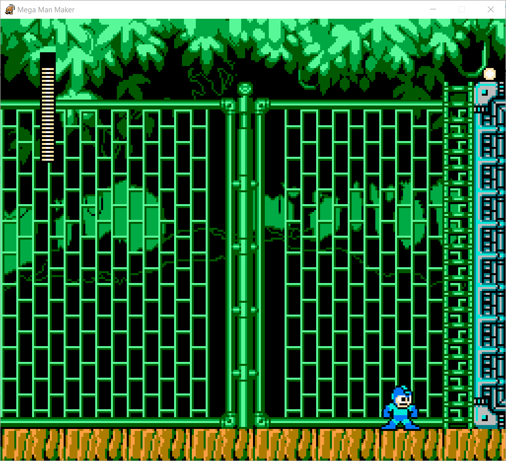
Compared to the first level, this level was definitely better. Though it wasn't the best of course. There were still problems with my level. One is the design choices. In the first couple of rooms, the player had trouble finding the ladder that takes them further into the level. The problem was that the green color of the ladder mixed too well with the background color. It was intentional and my intent was to make it a sort-of "hide and seek" puzzle. However, the result was not favorable. Another flaw is the map path. Players got lost in the map and had trouble with the flow. A couple of players felt like the pacing was a bit quick and hard to follow. Lastly, there was the flaw of knowing the items and abilities. I forgot that changing abilities could be done on the S key thus I added a lot of useless ability items scattered through the level. I misread the ability of the arrow and did not know the player could stand on it as well. It sort of made some puzzles useless or not as challenging as I expected. 

confusing path
How would you improve?
The things I would work on is knowing the abilities more. I need to read on the abilities and try them out more as well as knowing the default set of abilities given to the player. I will also need to be more careful of level design and making sure the player isn't too confused by the level while also having freedom and choice within the level. Overall, these are things that could be improved if I had taken more time with making the level and making sure everything flowed well. 

How was the overall flow?
The flow depended on the player mainly. Some players felt the level was great and played smoothly. Others thought it was confusing at times and got lost in certain locations. Few thought it went too fast and that they could not grasp what was happening. Though overall, the challenge of the level was appropriate. It depends on how the player plays to follow the level's flow.  

green on green is bad


Friday, March 29, 2019

Photography - On the Edge, Things, Panorama

On the Edge
For this photo, I did have an initial feeling of what kind of photo I wanted to capture. The hardest part was mostly, finding the right subject. The composition I wanted for this photo was definitely that long depth feeling. That meant my subject had to stretch further and deeper into the center of the photo. I achieved this with cropping and the black and white of the photo. 

 Things 
This photo was fairly easier to do, I did have the idea planned out already. The symbolism of a "tree house". I'm glad it turned out so well. I think this is one of the best photos I worked on. The singled out color of the tiny house contrasting to the large tree worked really well. 

Panorama 
I didn't have too much of a hard time finding a subject. I knew what I wanted to photograph, the harder part was doing it right. The editing was okay at points.


Monday, March 25, 2019

MegaMan Level 1 Feedback

Megaman Level 1 Feedback
What went right?
The map did fit the feeling of being an "intro" level. It introduced a good variety of "easy" enemies and did not have any complex design or puzzle. It introduced health packs and the flow of the map was easy to follow.

Annotated Map of Megaman Level 1

What went wrong?

The level itself was not long enough. It took roughly 1 minute and 30 seconds for most players to beat it. Some completed it under 1 minute when they skipped past all the enemies and followed the critical path. Some enemy placements were wonky, especially the first enemy encounter where the player could run into it due to the room transition to be wrong. The room was supposed to scroll instead of fading, which might have been a mistake on my part that I forgot to switch the room transition to scroll. 

How might you improve your map next time?
For the next level, I'll need to find a way to prolong the map without adding more enemies. Perhaps adding more groundwork and map puzzles could be a way to add length to the map without adding more enemies. I definitely need to playtest it more to make sure the length is considerably longer and if the enemies were appropriately positioned or balanced in terms of challenge. 

Enemy spawning too close to screen transition

Were the challenges presented appropriate to the skill level of the player?
I do believe the challenges were easy enough. After all, most players finished the level under 2 minutes. Though of course, it also meant the level was too short but introduction levels are usually like that. 

Was the critical path obvious?
Yes, the map was pretty straightforward. Though 2D maps are usually more linear in that case, save for a few right or left turns that usually lead to a dead end. Getting to the end was easy as long as you keep going right. 


How was the overall flow?
The map was fairly simple, consisting of only 11 "rooms". The flow was straightforward, linear even. Not much choice was presented to the player except keep going forward. 

Was the player taught everything needed to complete the level?
I do believe the playtesters were taught mostly everything needed in the introduction level. That would be what health packs and the energy element look like, how to deal with certain enemies, and using platforms to your advantage. 


Saturday, March 2, 2019

DnD Map 2 Tiered: Easy

DnD Map Tier: Easy
What went wrong?
Due to miscommunication and my busy schedule, I did not change much of my map from the last playtest to this group one. Thus the problems were almost the same as the last map's. Again it's linear, the boss was overpowered, and the setting was the same. 

What went right?
Luckily, the problem with this map (and my previous map) was that it was fairly easy and felt "tutorial"-ish. Since I was supposed to make tier 1 (easy) map, it worked out pretty well so that I didn't have to change much about my map. I did tweak the stats of the enemies and the boss and changed the number of items given to the players. So the requirements of the easy map would be apparent in my map. 

How was the process of working on a Level Design Team?

There wasn't much we did as a team. The only things we did together was coming up with a concept for the maps. It wasn't easy. It took us a while to decide on the setting and the items. But it was fun having maps connect even if the overall flow of the story was too consistent. I wish there was more we could do as a team. 

How might you improve your map next time?
Biggest mistake made this time is not giving the time to work on this thoroughly. Luckily my group did have a general setting/story for our maps as well as items so my map did fit along with the groups. I didn't get the chance to put much of my own ideas however which was disappointing. Next time I'll be sure to time management better so I could have made this map different from the previous one. Aside from that, I still need to work on balancing the stats of the enemies as well as using distance and location more as an advantage or disadvantage in my maps. 

Were enemies appropriate to the player "level"?
Again, the boss was too difficult despite bringing down the stats. However, I thought the stats for the boss were a disadvantage and made the boss easy to kill so I gave the boss abilities such as heal and a charged attack that allowed the boss to hit both players only if the boss did not do anything its previous turn. However, it made the boss a bit difficult. On the other hand, the players died just before landing a final blow on the boss. Thus I believe the boss was suitable for this level, but a lot depends on the dice rolls as well. The other enemies were easy to defeat as expected for a "tutorial" level, 

Were there appropriate teaching mechanisms for new items?
Not really, the number of items are limited for an easy map and there weren't many items I could have added. The players did not get all the items as well, they got 2 out of the 3 that were "hidden" throughout the map. Regardless they did not need to use the items until the boss. The items did not have a big impact on gameplay, however. It did bring the boss down to low health but the item used was one that "let the player roll a 6". 

Was it obvious where players we supposed to go?
Since the map outline did not change from the last map, yes. It's linear and very straightforward (as always). I need to work on making my maps less linear. Perhaps it's best to switch to graph paper instead of using the foldable whiteboard. 


How was the overall flow?
The flow was better than last playtest surprisingly. Since it's an "easy" level map, I didn't have too many ideas flowing through my head. I also erased the theme of fighting either the aliens or guards or both and just stood with fighting against aliens. That made it easier to keep track of enemies as there was only a small handful. The boss didn't have any complex abilities as I made them easier to understand for this playtest. I also made the story easier as the group came up with it together so I didn't have to write one entirely out on my own like last playtest. 

Friday, February 22, 2019

DnD Map 2 Feedback

DnD Map 2
What went right?
Things went smoothly but not in the way it should have gone. For the good part of it, I stayed within the time limit. The players went through the map smoothly. They experienced the map almost to a hundred percent of its entirety. The checkpoint and items aspect were used. 

What went wrong?
What went wrong would be that the map felt a bit easy. The enemies aside from the boss weren't too difficult, they were defeated within three to four turns. I didn't really choose items that would help the players. They didn't do much overall and were almost useless. My script wasn't solid, I would improv most of the scenes My map was too linear and didn't stretch long enough for range to play much of a factor in combat or encounters. 


How might you improve your map next time?
I should have made my own items that would fit the map as well as revising the map to be able to use the items provided in the rules. I also need a solid script to fall on. Most importantly, I need to think less about the tutorial because I made this map a bit too easy. The playtesters stated that this map felt like a somewhat difficult tutorial map. I could have probably made the enemies stronger and give them more abilities instead of just straight-forward attacking. Lastly, I need to make my map less linear, like my last map, the critical path is obvious and continues in a straight line. 

Were enemies appropriate to the player "level"?
The boss was difficult as it should be but the other enemies were fairly easy. I should have made the attack and defense of the other enemies higher. Or they could have had abilities that made them stronger. The boss might need to be weaker as it's abilities are already a bit overpowered. 

Were there appropriate teaching mechanisms for new items?
The players weren't taught to "use" the items. The items were just given and the items themselves did not have any impact on the level. They were pretty useless aside from two events. One was continuing to the main hall where the goggles allowed players to see the enemies and potential allies in the room. If they did not see them, the players would have needed to battle more enemies but the items are given were obvious and any player could have gotten it if they actually explored instead of going straight to the hallway. The other item was the boots of retreat. Since the enemies were easy to defeat, the players did not use the item up until they reached the boss and retreat from the boss because of consistent bad-rolls (but the boss was already low enough to die if they rolled a 4 or higher). 

Was it obvious where players we supposed to go?
Yes, the map was too linear for a medium-level map. There were only three main rooms connected to each other in a straight line. I have no clue how I missed that when I was making the map. Perhaps it's because my own train of thought is too linear. 

How was the overall flow?
It was good, though there were long pauses where I did mental math in my head (that usually takes a while) to figure out how much damage enemies did or how much health they had left. However, I could have really improved the map by creating a solid script or giving enemies more abilities as well as giving the player more abilities/choices. I hope I can do better next time, especially for the tiered map as it's a group project. I wouldn't want to fail my team. 

Sunday, February 17, 2019

Simple DnD Map Version 2 Feedback

Simple DnD Map Version 2
What went right?
Things went smoother this time since I have a "script" or something to fall back on and I was more keen on what I was supposed to do. I also added a "grid" to my map, though it doesn't really change the gameplay. Again, my map's overall layout was simple, there were not many turns or twist. The core path was linear, only diverting for side rooms that weren't part of the main path. Players start off in the Tomb of the Dead. Just a starting area for the players to get their bearings and try out different actions like perception and interacting with the door which opens to the Hall of Reeds. There were three weak skeleton enemies for the players to fight as a tutorial enemy. They have fairly weak stats. All with 1 point in attack and 2 in defense. Each skeleton has 5 health. The players had no trouble defeating them. The boss was a bit harder. This boss could hit both players. It's stats were 3 attack and 2 defense with 10 health. One of the players died but the other managed to kill the boss. It's still a bit strong but at the same time, both players lasted a fairly good length of time. It could have been because of luck and rolls. The length of the map was good, the players finished around 18 minutes. 

What went wrong?
Nothing went wrong in my opinion. Maybe I should have weakened the boss but that defeats the point of a boss. I could have added more interactivity to the map but there wasn't much to do for the first set of rules. 


How might you improve your map next time?
I could add more interactivity to the map, let the players explore more. Maybe even add lore and backstory? 

Were the challenges presented appropriate to the introductory/tutorial nature of the level?
More or less, the same as the last playtest. I tweaked the monsters to be a bit weaker but the results and gameplay felt the same. Mainly because the dice rolls and luck plays a large factor in these things. 

Was it obvious where players we supposed to go?
Yep, the map is linear and the only thing that diverted the players from the main path would be the side rooms but those are optional. Players do not need to go to those rooms to complete the map. The map is one long path comprised of three sections. One is the spawn room where the players start in, it's empty and used for the purpose of letting the players figure out basic motor controls such as movement and observation. The second room is for tutorial combat, it's a long hallway so the players with range ability and players with melee only could test out their attacks depending on their location. Though I doubt it really helps because both the enemies and players can move and then attack. If anything a ranger could snipe the first enemy to engage in combat.  

How was the overall flow?
Since our group was the same group from the last/first playtest, we already knew what to expect. Perhaps that why there wasn't much feedback that was effective. However, it's nice to see the improvements everyone has made and because it's the same group we can tell what kind of changes were made to the maps and what improvements there are. Everything went smoothier this time so we finished fairly early. 


Sunday, February 10, 2019

Simple DnD Map Version 1 Feedback

Simple DnD Map Version 1
What went right?
My map's overall layout was fairly simple, there were not many turns or twist. I wanted the first map to be more linear and catered to being a tutorial level for the players. The first area (aside from the spawn area) is the Hall of Reeds. There were three weak skeleton enemies for the players to fight as a tutorial enemy. The playtesters had no problems defeating them. The boss was both right and wrong. It might have been a bit strong but at the same time, the players lasted a fairly good length of time. This could have been both the impact on the dice rolls and luck, however. The length of my map was also fairly good. The players got through it around 20 minutes. 

What went wrong?
The part that went wrong was that my map lacked squares, making it a bit more difficult to navigate and the combat didn't apply the range rule with the classes. The map was also more basic, it didn't give obstacles aside from enemies for the player to interact with. Also, I have never played DnD before so getting into DM-ing was rough at first. I didn't write a script to fall back on so the storytelling wasn't as smooth as I intended it to be. I didn't know we had to give similar stats to the enemies so the combat was wonky. I wasn't exactly sure how combat worked so I had to quickly learn and calculate the rolls and stats.

How might you improve your map next time?
The feedback I received from this playtest was extremely helpful. For future playtest and to improve my map I'll be adding grids so the players can use the range advantages of the ranger class as well as having the immersion of the map in terms of length. I'll do better with storytelling and definitely make sure to add stats to my enemies beforehand. Having a script on hand to fall to would be nice too.  


Were the challenges presented appropriate to the introductory/tutorial nature of the level?
I gave out challenges that I thought were appropriate for an introductory level. The first enemies that the players encounter were three skeletons each with a defense of 1 and attack of 2. They weren't extremely weak but not strong either. Though my weak dice rolls also made them a very easy challenge, most of the time I rolled numbers lower than 4 which made the enemies very pitiful. Regardless they served their purpose as fodder. However, the next enemy was a small boss with a defense of 3 and an attack of 3. It wasn't too difficult, the playtesters spent a fair amount of time in combat with this boss. However, at the end with the last standing player and the boss near death, I luckily rolled a 6 on the boss's attack turn and defeated the last remaining player. It was a very close fight and I felt it was fair. 

Was it obvious where players we supposed to go?
Yes, the layout was more on the linear side. There were only three main rooms and it's lined in a linear path. There are two other rooms that were meant for items (one for an armor piece and one for a weapon) but I later learned they were not necessary for this current version of a DnD map.  

How was the overall flow?
For a first map, things went pretty smoothly. Mainly it was thanks to a playtester who had DnD experience to explain things to me and the other playtester, both who have never played DnD. He was extremely help in explaining the enemies and how combat worked because those were the two parts me and the other playtester had trouble grasping. Things could have gone smoother if I had a solid script and enemy stats starting this campaign. But regardless, things went better than expected for a first run.